Opposing Views Final Spreads
Below are the final spreads for the book. This was a very challenging project but I liked how my ideas progressed over the course of the project and I was able to use what I learned over the course of the semester to project my ideas. Time management was also a challenge for this project because of Thanksgiving break. After doing this project I am really proud of myself and I am so happy to see how much I’ve learned in VC so far. I can’t believe this semester is already over and I can’t wait to continue in VC this spring. 


Idea Progression
When going back to the idea phase, I found it helpful to make lists and word webs. After making the lists, I also talked to other people not in VC to see opinions and views of people that didn’t know what the project entailed. By going back and forth with lists and talking to people I’ve come up with more concrete ideas.
Lettering
Today in Typography we spent clas

s time looking at different artists that specialize in lettering. We learned how lettering and typography are different. Typography is a system of letters involving construction. Lettering is more of an illustrative typography thats crafted and created for a specific situation. I now have a clearer understanding of how to use lettering for the final project. Two artists’ lettering work I liked from today were Jessica Hische (pictured on top) and Ken Barber (pictured on bottom). 


Preliminary Type Ideas
These are just a few ideas that I started to execute for type. The top image is “3.9” and is supposed to be representative of a GPA in relation of Greek Life. My idea there was to show that Greek Life takes up a lot of time and not a lot of time can be put toward schoolwork. This wasn’t working because 3.9 is a high GPA and didn’t represent the view I was trying to portray. Also people were reading it as a blood alcohol content level. After this composition I realize that I need to go back to the drawing board in terms of ideas for Greek Life. The middle image says “wait” out of cut paper for the jaywalk. This rendition doesn’t work be because it is 1+1=1 and is just generally boring. The bottom image is a Bible verse in colored pencil for Kirkbride Jesus. I thought this was a good way to represent the catholic religion in words that don’t necessarily say it. This project is already a challenge and I need to thoroughly sort though my ideas.


Preliminary Image Ideas
These are a few initial ideas I had for image. The top image was done in gouache for the Greek Life topic. At this stage I had “3.9” as a GPA for type and these red cups as image. After I realized both of these views were sort of the same. The middle image is a Jewish Star in colored pencil. The flames are supposed to represent the fact that Kirkbride Jesus only promotes Christianity and demotes others like Judaism. I had the bible verse on the other side as type at this stage. The bottom image was supposed to be for Police Interaction With Students but this image wasn’t really portraying anything about that. I need to go back and think of more concrete ideas and views for the project now that I have a better understanding. 


Topic Finalization
Today’s class was used to finalize the topic list. The final list is 1. Greek Life 2. Police Interaction With Students 3. Kirkbride Jesus 4. Jaywalking 5. Campus Food Quality and Selection 6. Tank Top Dress Code in Fitness Center and 7. Studio hours. The next step is to get some ideas and first compositions going . Type and image are required for each topic and are on one spread. We have to use the seven mediums: 1. Cut Paper 2. Photography 3. Pigments 4. Dry Media 5. Print Making 6. Assemblage Through Photography and 7. Re-appropriated Matter.
Modern Nostalgia Final
I think the execution of my object in the final rendition was successful. I changed the scale size of my object as well as the medium of executing my object to acrylic paint. The paint enabled me to create various values. The wider range of values gives the object dimension. I changed the size of my photo to be smaller and the object size bigger, which helped my final composition.

Final Introduction
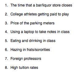
I can’t believe that we were introduced to the final today. This semester really flew by! The final project is combined for Typography and Form and Communication and the objectives for the projects are cumulative. The project is called “Opposing Views” and consists of a book of seven topics related to UD campus life and their views are shown side by side. One view is presented as an image and the other type. This project seems extremely challenging and exciting. For Wednesday we have to bring in a list of at least seven topics with a point of view, it could be for or against. Here is my list for wednesday:


